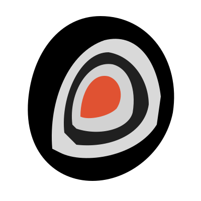
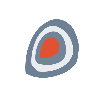
The mark is a stencil peony bud — concentric petal cuts resolving to an accent centre. It reads as a single form at 16px and holds its internal structure at poster scale.
This is the multi-page printable view of this section. Click here to print.
Logo
The mark, the four lockups, and the rules that keep them legible.
1 - Lockups
Four approved lockups, rendered live, and where each one belongs.
Four lockups are approved. Each has a defined context; using one outside its context is what makes a layout feel off-brand even when the colours are right.
All four are built with HTML and CSS rather than flattened artwork, so spacing comes from natural text flow and never needs re-kerning.
The four lockups
Two-line (default) and one-line
projectious
· work
Two-line · headers, slides, cards · min 120px
projectious · work
One-line · navbars, footers, signatures · min 140px
Dot-replace and stacked
projectious
work
Dot-replace · compact horizontal · min 160px
projectious · work
Stacked · app icons, avatars, slide corners · min 60px
| Lockup | Composition | Use for | Minimum width |
|---|---|---|---|
| Two-line | Mark + “projectious” over “· work” | Headers, slides, cards — the default | 120px |
| One-line | Mark + “projectious · work” inline | Navbars, footers, signatures | 140px |
| Dot-replace | Mark substitutes the dot in “projectious.work” | Compact horizontal contexts | 160px |
| Stacked | Mark above the wordmark, centred | App icons, avatars, slide corners | 60px |
On light and dark
Every lockup has a light-surface and a dark-surface rendering. The mark’s inner cuts pick up the surface colour, so it never needs a plate or a knockout box.
The same lockup on both surfaces
projectious · work
projectious · work
The mark alone
The mark may stand alone only where the wordmark is already established nearby — an app icon on a page that names the product, an avatar in a signed-in context, a favicon.
Standalone mark — 96 · 64 · 48 · 32 · 24 · 16px
Minimum for the standalone mark is 24px. The 16px rendering exists for favicons only, where the browser supplies the name.
Product line
Product names extend the wordmark with the same dot construction and flow.
Product-line extensions
projectious · guard
projectious · forge
projectious · flow
Wordmark construction
The separator between “projectious” and “work” is a dot in the mark’s own
geometry, not a typed period. It takes slate on light surfaces and midnight-11
on dark. Spacing is handled by flex layout so the wordmark reflows naturally —
do not hand-kern it or convert it to a static image.
The wordmark keeps the accent
“work” is set in orange-9 (#E05232). As body text that value would be too
low-contrast, but WCAG 2.1 SC 1.4.3 exempts logotypes — “text that is part of a
logo or brand name has no minimum contrast requirement”. The wordmark is the one
place the identity accent is used as letterforms.
Do
Use the two-line lockup unless the space is explicitly horizontal. Let the flex layout handle spacing.
Don't
Rebuild a lockup by hand, change the order of mark and wordmark, or set the wordmark in a different typeface.
2 - Usage
Clear space, minimum sizes, monochrome variants, and placing the mark on colour and photography.
Clear space
Exclusion zone — 1x the icon height on every side
Nothing enters the dashed zone
Minimum clear space is 1× the icon height on all sides. Nothing — text, rules, image edges, other logos — enters that exclusion zone.
At a 40px mark, that is 40px of clear space in every direction. The zone scales with the mark, so it never needs recalculating per context.
Minimum sizes
Minimum sizes — 48 / 32 / 24 / 16px
48px
32px
24px — minimum
16px — favicon only
| Variant | Minimum |
|---|---|
| Icon (standalone) | 24px — 16px for favicons only |
| Stacked lockup | 60px |
| Two-line lockup | 120px |
| One-line lockup | 140px |
| Dot-replace lockup | 160px |
Below these sizes the petal cuts collapse into a smudge. If the space is smaller than the minimum, use a smaller variant rather than scaling one down.
Monochrome
Four monochrome treatments are approved, for print, fax, embossing, and any single-colour reproduction:
Monochrome variants
Midnight
Black
White reversed
Grey
| Variant | Mark | Inner lines | Surface |
|---|---|---|---|
| Midnight | #1d3352 | White | Light |
| Black | #000000 | White | Light |
| White reversed | #ffffff | Slate | Midnight |
| Grey | #9299a4 | White | Light |
The white-reversed variant uses slate for its inner lines rather than the background colour, so the petal structure stays visible. All petal structure must remain legible in every monochrome variant — a solid silhouette is not an approved treatment.
On colour
Placing the mark on colour
Lighter than slate-5 -> light mark
Darker -> dark mark
On accent → white ring
On photography -> midnight backing
| Background | Treatment |
|---|---|
| Lighter than slate-5 | Light-surface mark |
| Darker than slate-5 | Dark-surface mark |
Accent (#E05232) | Mark with a white ring border |
| Photography | Semi-transparent midnight backing behind the mark |
The slate-5 threshold is the decision rule: measure the background, pick the side it falls on. On the accent, neither variant has enough separation on its own, which is why the ring exists.
On photography
Never place the mark directly on an unmodified photograph. Apply a semi-transparent midnight backing — a shape, a scrim, or a gradient — so the mark sits on a controlled surface. The backing is part of the logo treatment, not an optional enhancement.
Watermark
Watermark — uniform wash, no accent
For background use, the mark may run as a watermark at 8–15% opacity. It renders as a uniform wash: no accent colour in watermark mode, since a single coloured element at low opacity reads as a printing error.
Favicons
Icon-only, on a midnight tile, with 12% padding. Corner radius scales with size:
Favicon tiles — 12% padding, radius scales with size
48px / r8
32px / r4
16px / r2
| Size | Radius |
|---|---|
| 16px | 2px |
| 32px | 4px |
| 48px | 8px |
| 180px | 36px |
Do
Measure the background against slate-5 before choosing a variant. Keep the full clear-space zone even when layout is tight.
Don't
Recolour the mark outside the approved variants, add effects (shadow, glow, outline, gradient), rotate or skew it, or place it on a busy photograph without a backing.
3 - Files
Delivered formats, when to use each, and where to download them.
Formats
| Format | Contents | Use for |
|---|---|---|
| SVG | Vector source | Primary for web and print |
| PNG @1x | 16 / 32 / 48 / 64 / 128 / 256 / 512px | Native-resolution raster |
| PNG @2x | 2× pixel dimensions | Retina — required for web |
| PNG @3x | 3× pixel dimensions | Super-retina — mobile |
| ICO | Multi-resolution (16 + 32 + 48) | Favicon |
| apple-touch | 180×180 PNG | iOS home screen |
SVG is the source. Raster exports exist for contexts that cannot take vector — prefer SVG wherever the medium allows it.
Variants
Each raster size ships in five variants:
icon-light— for light surfacesicon-dark— for dark surfacesicon-mono-black— single-colour blackicon-mono-white— single-colour white, reversedicon-mono-gray— single-colour grey
Downloads
The logo files are served from this site and are also in the repository under
brand/logo/.
| Asset | Link |
|---|---|
| SVG — light | icon-light.svg |
| SVG — dark | icon-dark.svg |
| SVG — mono black | icon-mono-black.svg |
| SVG — mono white | icon-mono-white.svg |
| SVG — mono grey | icon-mono-gray.svg |



Licence
Logo files are brand assets, not MIT-licensed code. You may reference and display them under the terms in Licensing; you may not modify them or use them to imply endorsement. See also the Trademark guidelines.